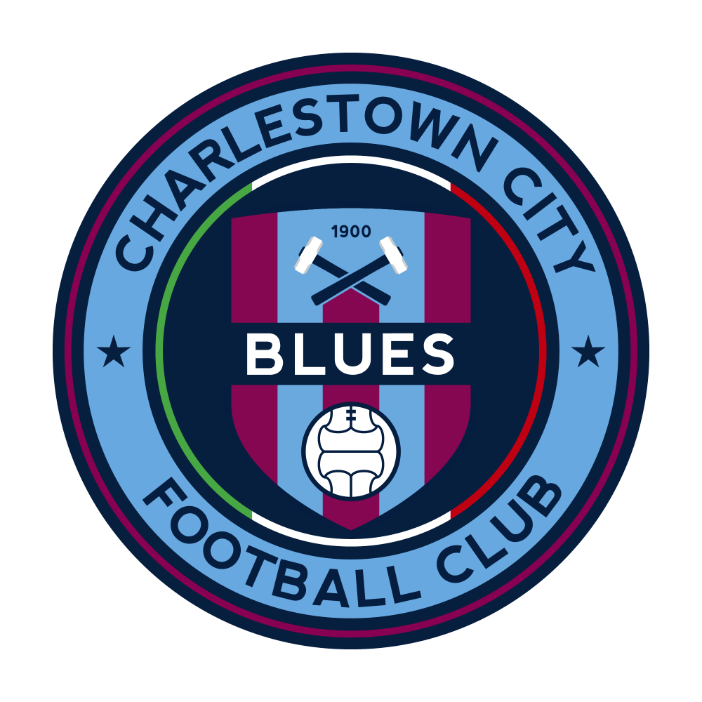
Modernised logo for the Charlestown City Blues, I’ve modelled it on the same roundel style being used by New York City FC and Melbourne City FC. Seemed logical give the ‘city’ connection, and they all wear sky-blue.
The Charlestown City Blues were formed when Highfields Azzurri and Charlestown United merged … and their current logo is pretty uninspired, and their previous logo wasn’t so great either.
Colours come from their previous logo and kit (they appear to have since dropped the maroon), hint of the Italian flag is a reference to the Azzurri (something that they also had on their previous logo), and the hammers are a reference to the old Charlestown United team “The Hammers”.