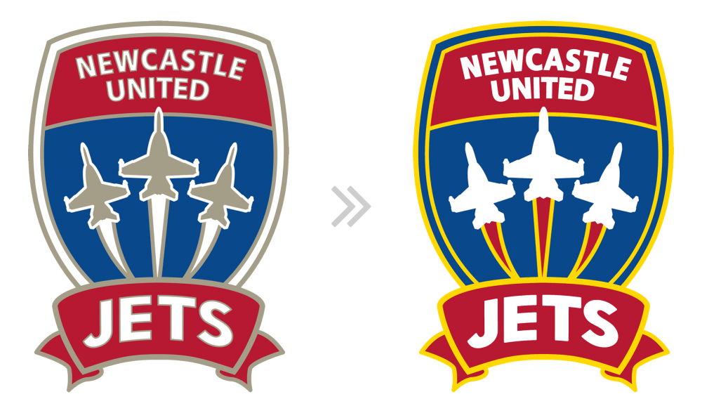
Closer look at the quick Newcastle Jets logo recolour that I used on my home and away kit concepts. Primary change is that I’ve replaced the gold with yellow. I’ve removed the gold outline around the text, which should make it clearer at small sizes – the current white with gold outline gets a little muddy at small sizes. Also changed the treatment of the jets, making them white instead of gold helps better define them against the blue background.
Newcastle Jets Logo Recolour

