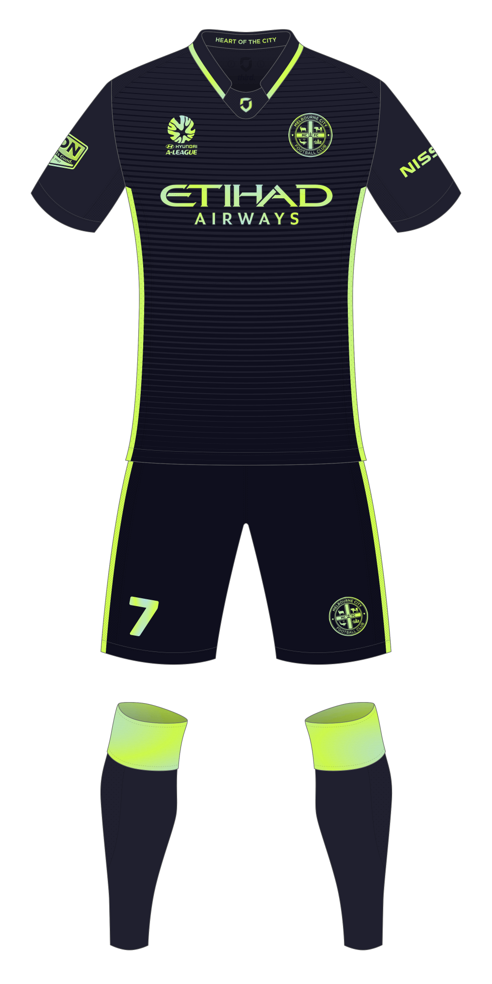
A quick Melbourne City third kit concept to go along with the home and away kits I posted last week. A dark-grey/near-black with bright trim and details. The treatment applied to the logos and trim is inspired by the iridescent detailing on PSG’s new 2016/17 third kit – the effect itself isn’t particular easy to replicate in a ‘flat’ graphic.
Melbourne City FC Third

