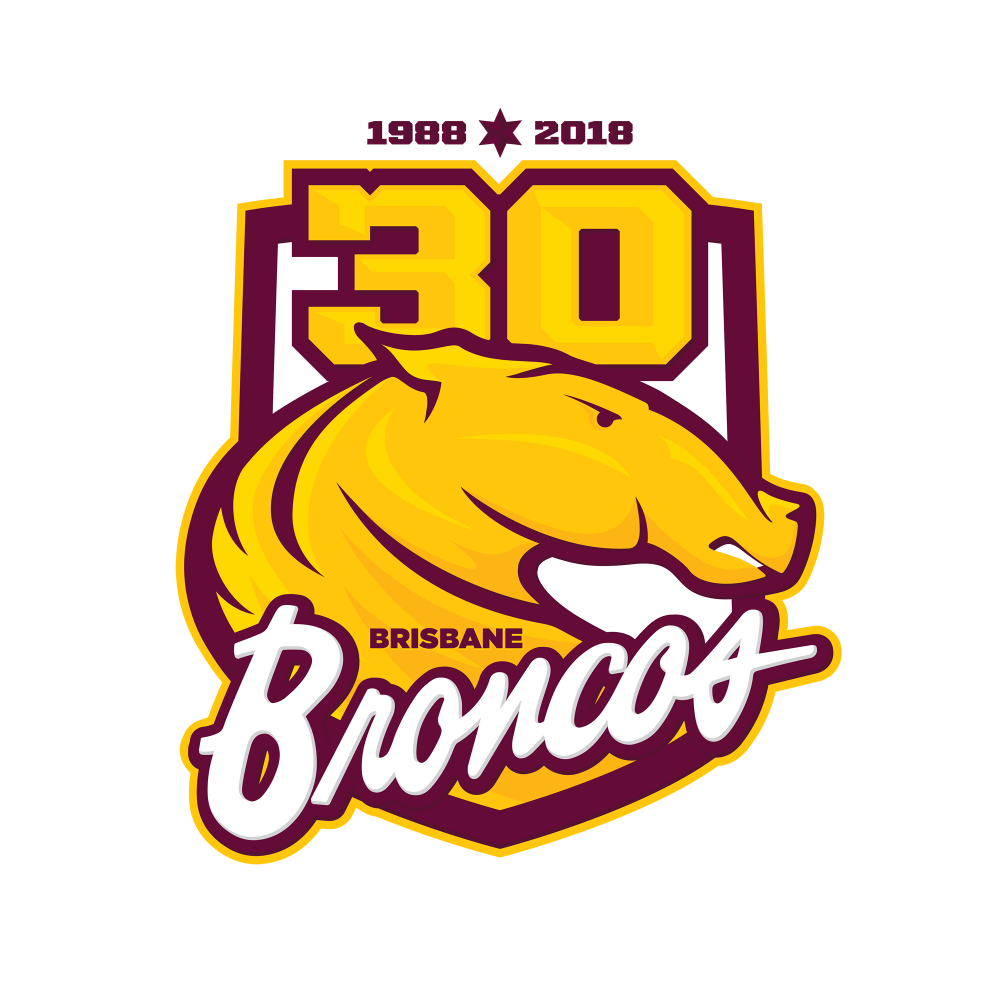
The Broncos will celebrate 30 years in 2018 and there is a reasonable chance they’ll mark the occassion with a special logo just as they did for the 25-year mark back in 2013.
Unfortunately the 25-year effort looked like it was cobbled together from some clip-art, and overall was pretty disappointing… which resulted in me knocking together my own alternative 25-year logo.
In 2017, and for the first time in 20 years, the Broncos jerseys won’t be manufactured (or designed) by Nike with the Broncos moving across to ISC. Nike’s attmpes in recent years have been pretty ordinary to say the least, but the new jerseys by ISC are pretty great – especially the home and heritage.
So, inspired by the shiny new 2017 jerseys, I set about creating a 30-year concept logo that I’d be more than happy to see adorning the chest of the Broncos in 2018.
I’ve updated the alternate bronco that I’d used on my previous 25-year logo to add a little more detail, with the colouring – predominently gold instead of maroon – chosen both a s acallcack to their original logo, and so it stands out nicely on their predomently maroon jerseys.
Paired with that is the classic ‘Broncos’ script from their original logo. The shield is also a minor callback to that original logo. Up top a big bold ’30’ to mark the occassion, ‘1988-2018’ for their time in the compeition, and a six-pointed star for their 6 premierships (which I’ll happily update to a seven point star if they win in 2017).
A couple of tiny tweaks and this would work as a primary logo going forward – I’d probably just keep the broncos and the script, keeping it nice and simple – I’ll clean-up a version like that and post it at a later date.
Overall pretty happy with how this turned out, it’d look cracking on a proper 1988-based heritage jersey in 2018. So, to the Brisbane Broncos and ISC, what do you say?

