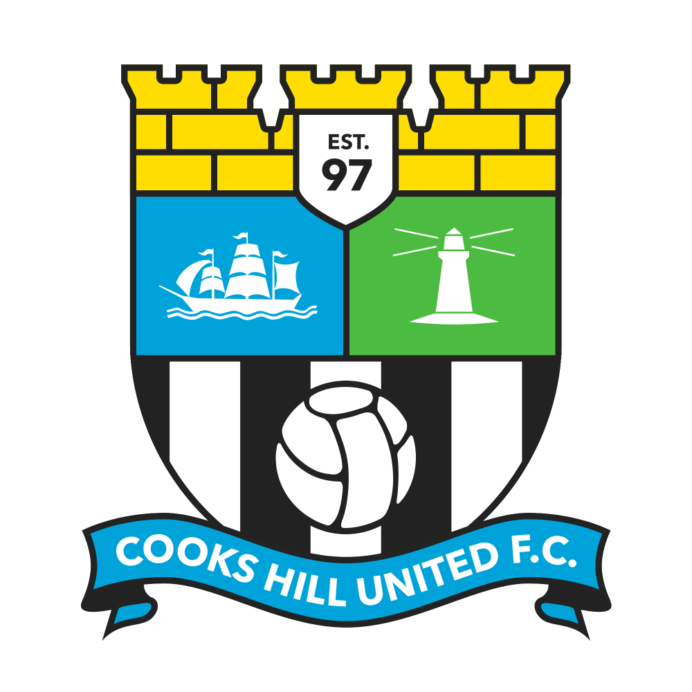
Bit of a mish-mash in this one. The banner across the bottom is based on that from the current Crystal Palace logo, but redrawn so that it is actually symmetrical. Changed the brown behind the ship to blue (because… water), and used the Manchester City ship because it was the one I had on hand, same for the ball – it’s from the Manchester United logo. I did however draw the lighthouse, and overall shield shape, from scratch. And as much as I like the rampant lions on the current logo, I dropped them for the sake of simplifying the logo.
Cooks Hill United FC

