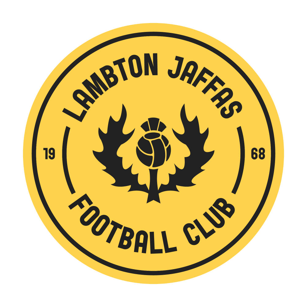
Ditched the Manchester United style logo of their current logo, and only kept, albeit in a modified form, the laurel wreath in the middle. Also went for a yellow that is less ‘canary’ than what they currently use.
Lambton Jaffas Football Club


Ditched the Manchester United style logo of their current logo, and only kept, albeit in a modified form, the laurel wreath in the middle. Also went for a yellow that is less ‘canary’ than what they currently use.

I'm Dean Robinson and third. is a creative outlet combining two of my favourite things – sport and design.