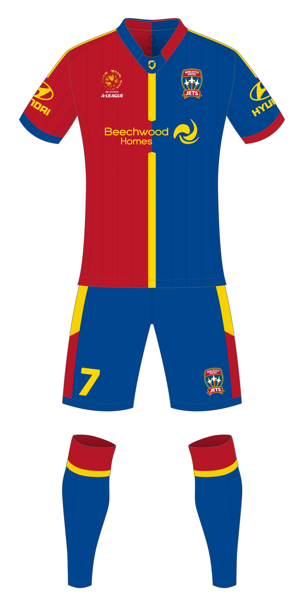
A couple of significant deviations away from the usual Newcastle Jets kit, I’ve swapped the red and blue stripes for a 50/50 split design heavily inspired by the kits worn by Galatasaray in recent years. The second big changed is that I’ve dropped all the metallic gold accents and used yellow instead – which may not be a popular change.
I prefer how the yellow looks when compared to the gold, largely because in the wrong light, or if poorly applied to the design the gold can turn out as a weird tan/khaki/brown colour which isn’t so nice. I’m also a fan of how the blue/red/yellow combo looks on Barcelona’s kit, I even contemplated using the darker shades of red and blue on this design.
I’ve also recoloured the Jets logo slightly to incorporate the yellow – I’ll post a better look at the recolour later on.
At this point, anything would be an upgrade over the atrocious gradient stripes they wore last season – which also happens to include a good example of where the gold doesn’t look gold.