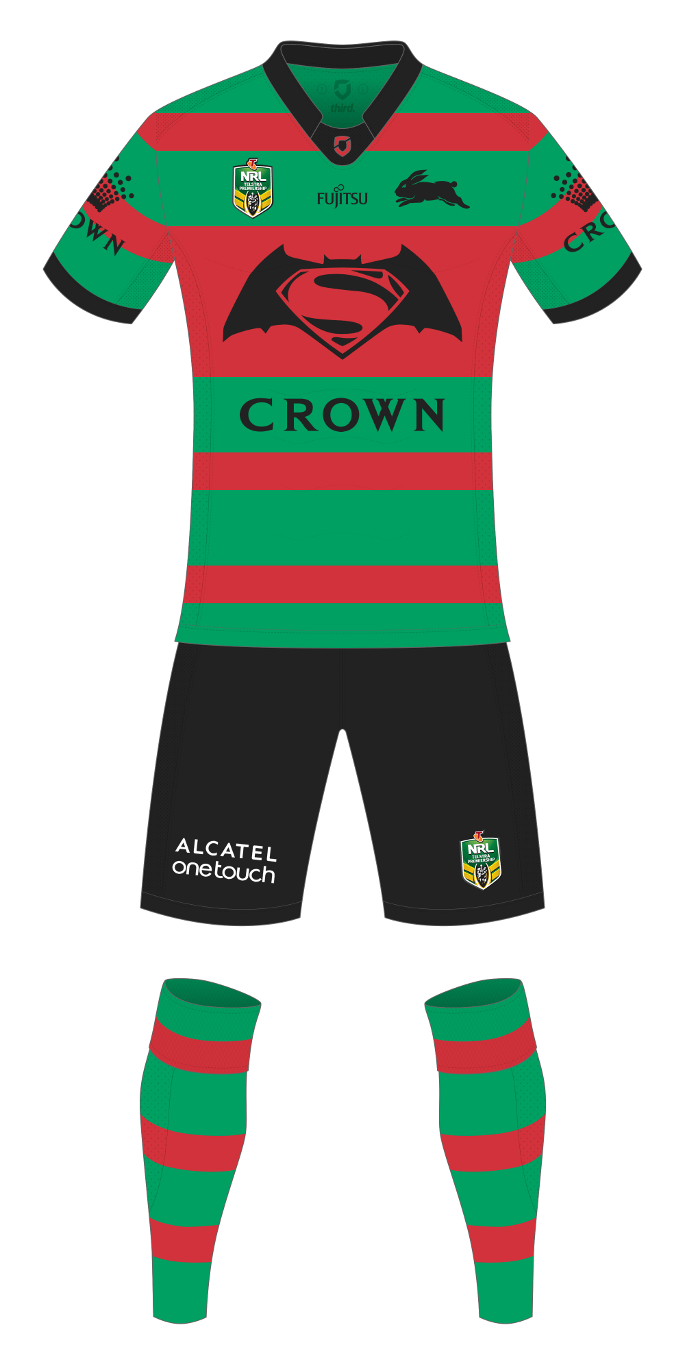
Souths are this year once again including a Superman-themed jersey in their line-up, this year it’s to promote Batman v Superman that’s out in a couple of weeks time.
The designs of these ‘special’ Superman jerseys have been historically been pretty ordinary with unnecessary textures and faux-3D looks resulting in a bit of a muddy mess. I get that they have been trying to mimic the texture of Superman’s suit, but it doesn’t work.
This year’s effort is possible the most disappointing of the lot, the glowy-3d-trainwreck treatment that’s been given tot he Batman/Superman logo looks really bad.
So, what if you stripped all that over embellishment away, and just tried to integrate the logo into the regular Rabbitohs’ jersey? That’s what I’ve tried to do here, it’s also got a bit of last year’s World Club Challenge look to it with the wider cardinal bar across the chest to accommodate the Batman/Superman logo.
It would probably be even better if you could drop the Crown logo from the front, but realistically that’s not going to happen.

