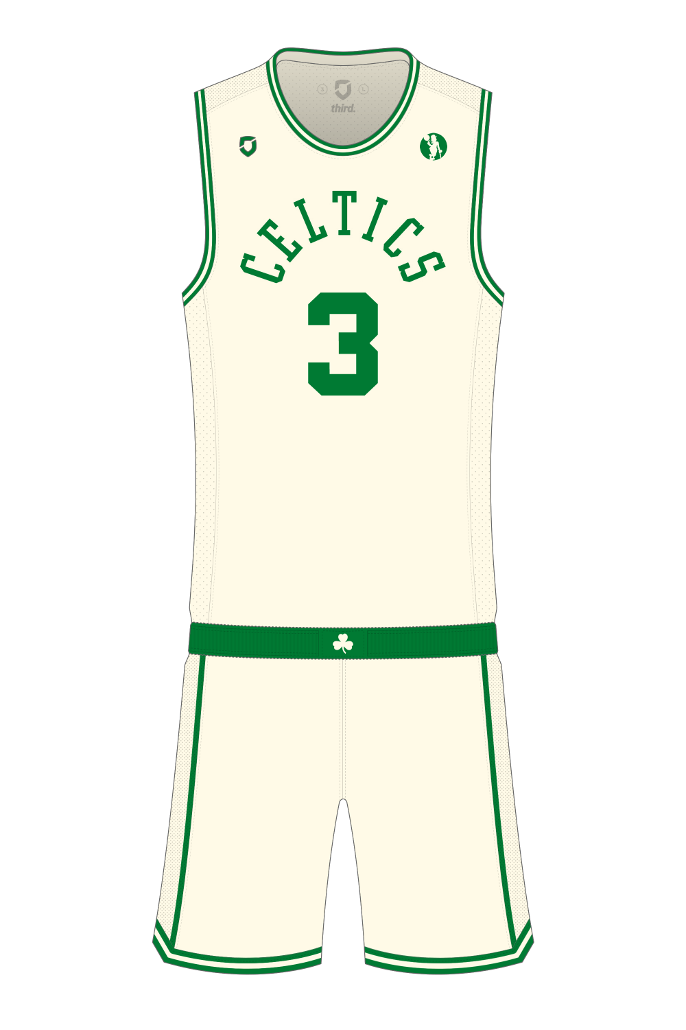
Day two of #maymadness, and it’s the Boston Celtics. I couldn’t bring myself to make any significant changes to their existing home or away jerseys, so I’ve kept things simple and gone with an alternate instead.
The Celtics already have two alternates in their rotation, a green jersey with black trim, and the sleeved grey ‘parquet pride’. Never been a huge fan of the green/black alternate, and I despise sleeved jerseys so there is room to move – I’d go close to giving the grey alt a ‘pass’ if it lost the sleeves and had green names/numbers instead of white.
What I’ve gone with is the arched ‘Celtics’ wordmark from one of their secondary logos, on a cream/off-white jersey, give the jersey a faux-heritage feel to it despite the Celtics having never actually worn something exactly like this.
I quite liked the use of this type of shade on this season’s Christmas jerseys, and surprised we haven’t seen more of it previously – especially from the recently rebranded Milwaukee Bucks who now have a specific cream colour in their official palette.

