Day twenty one of #maymadness, and it’s the Oklahoma City Thunder.
Make no mistake, the Thunder have the worst identity in the NBA. Hands down. No contest.
Hideously generic primary logo, with nothing ‘thundery’ about it. Zero secondary logos, too many colours. Even the team itself doesn’t seem to be a massive fan of their current jerseys given how little they’ve worn them during the playoff with almost all games being played in their (also awful) white sleeved jersey and their (ok) all-navy-vertical-wordmark jersey.
Hopefully they’ll be on the receiving end of new logos and jerseys when the league-wide Nike contract kicks in, because hot damn do they need it. If I were Durant I’d leave during the off-season solely because of their branding.
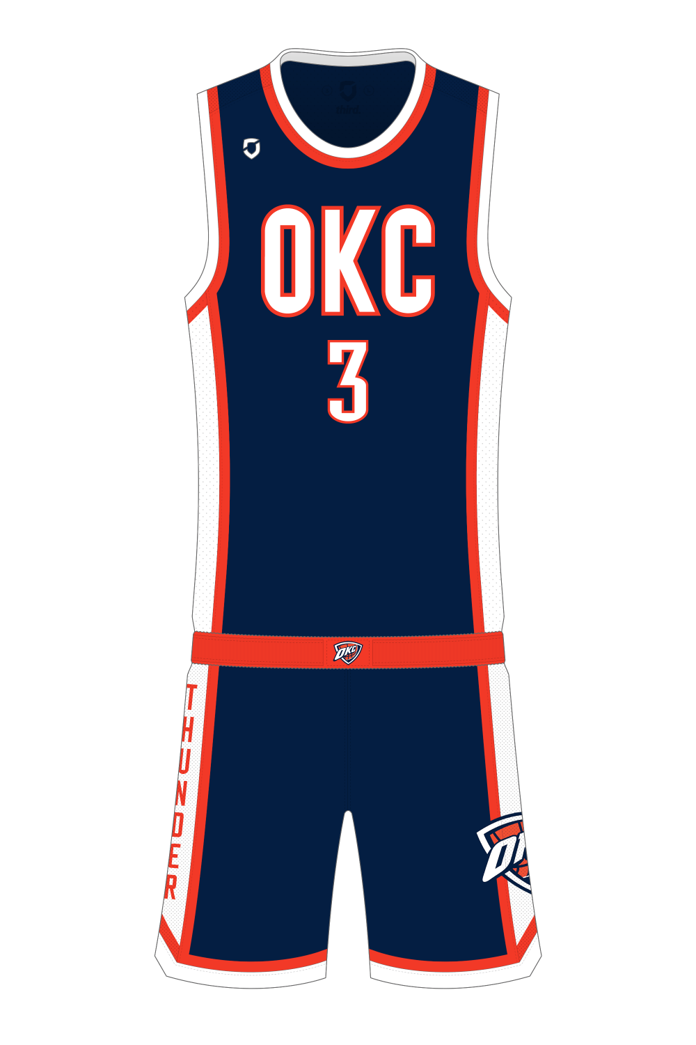
Ok, enough complaining, what have I done about it. I started with their orange alternates (which I like, even though I know not everyone does), originally I was just going to do a straight invert, navy jersey with orange trim, but it felt too dark, so I switched the ‘OKC’ and numbers to be white, and added white side panels and trim.
Shorts are based on those worn with their navy alternates, with a vertical wordmark on one leg, and a simplified (less colours, no random swoosh lines) version of their current logo on the other.