Nike officially unveiled all 30 “statement edition” jerseys for the upcoming season last week, and while some are ok, there are few that I really dislike. This includes the black-for-blacks-sake Celtics jersey, I’d almost go as far to say that I hate it.
Not sure whether it’s because it’s black, or because the white outline on the green lettering/number is jarring, or what it is, but I don’t like it at all. I was never a huge fan of the green-with-black-trim alternate jersey that the Celtics have been wearing for the past few years, and I assume this is the replacement.
While the argument can certainly be made that the Celtics don’t need a 3rd (or 4th) jersey – it’s a hard thing to avoid these days – however it surely should be easier to come up with something a little more unique rather than “just another” black jersey.
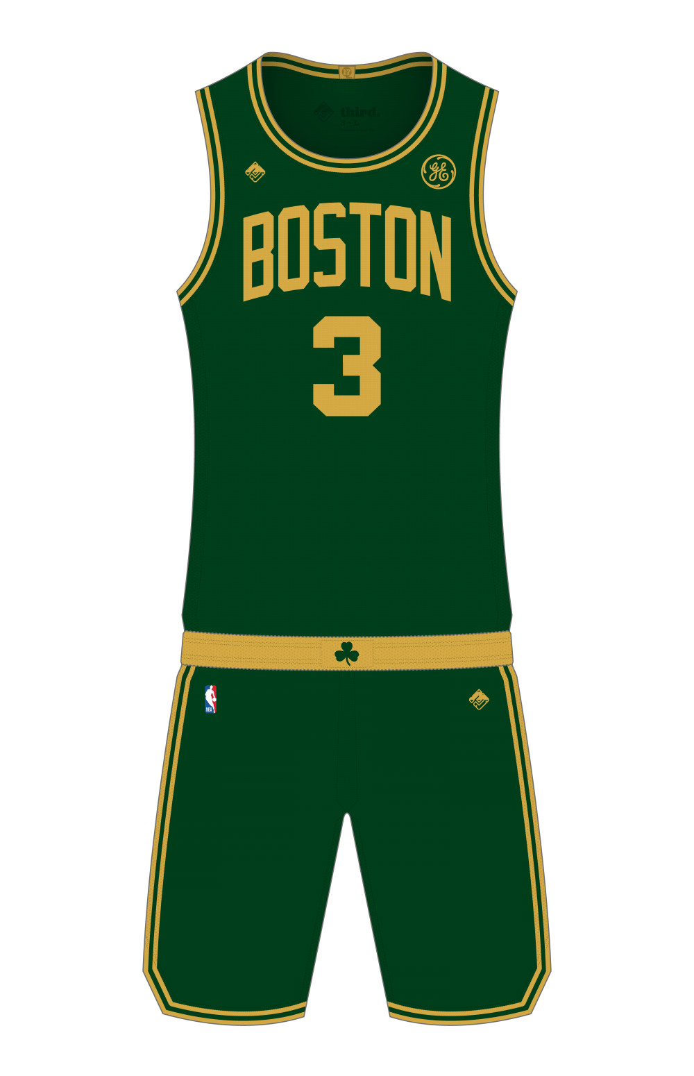
Something like this perhaps. A dark green base – to satisfy the “desire” for a darker option than the standard road (sorry, “icon”) green – with gold trim, and ‘Boston’ across the chest. Why gold? Because it provides good contrast against the dark green base, and also lets this jersey fill the slot of the St Patrick’s Day jersey that the Celtics have been wearing for several years. Everything else is inline with the template of their regular jerseys. If it ain’t broke, don’t fix it.
I’m obviously biased toward my own designs, but this would have been much, much better than that black thing.
I would probably prefer to see this gold be a little lighter/brighter in real-life, but it is tricky colour to reproduce digitally.